TrafficJunky’s Abusive Ad Experience Guide
We’ll be highlighting the abusive ad experience with a series of well-crafted SFW (Safe for work) banners. Your banners should not look like the examples below.
Let’s get started, shall we?
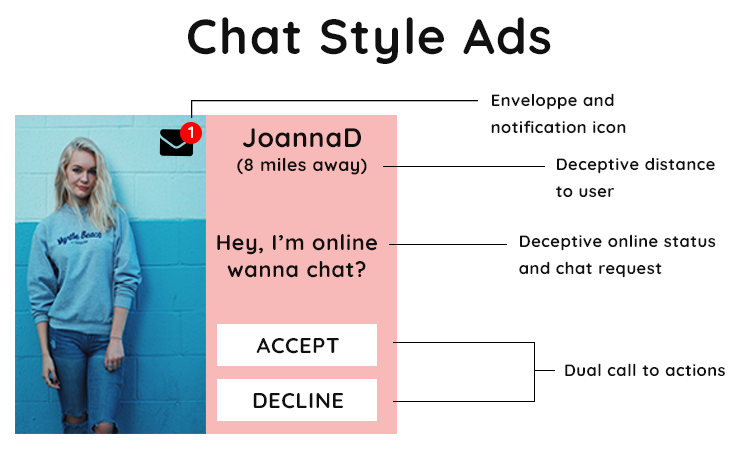
The deal with chat style ads is they are conceived to be deceptive and incite the visitor to click and expect something he’s clearly not going to get. Distance, notification icons, statuses, and dual call to actions are staples with this type of ad.
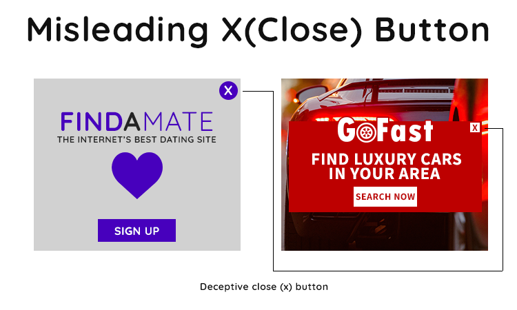
While these ads break none of the other rules, the advertisers decided to add the dreaded “x” button which does not close the ad and will redirect the user to their landing page.
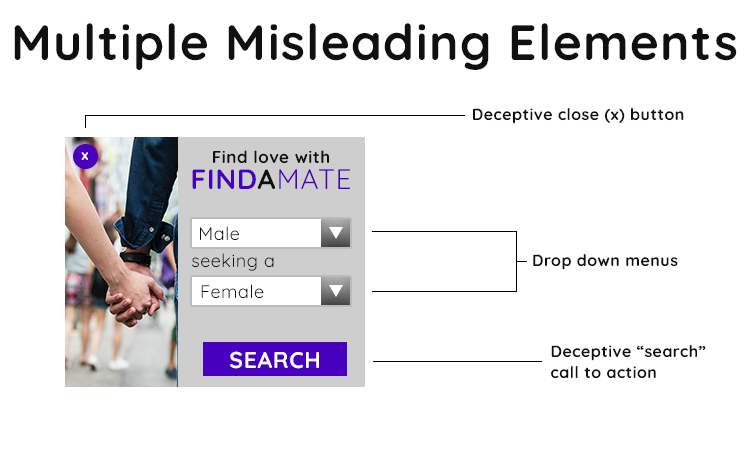
When it comes to these banners, they feature a combination of deceptive elements such as the aforementioned “x” button, fake drop down menus and search call to actions. See below for another example:
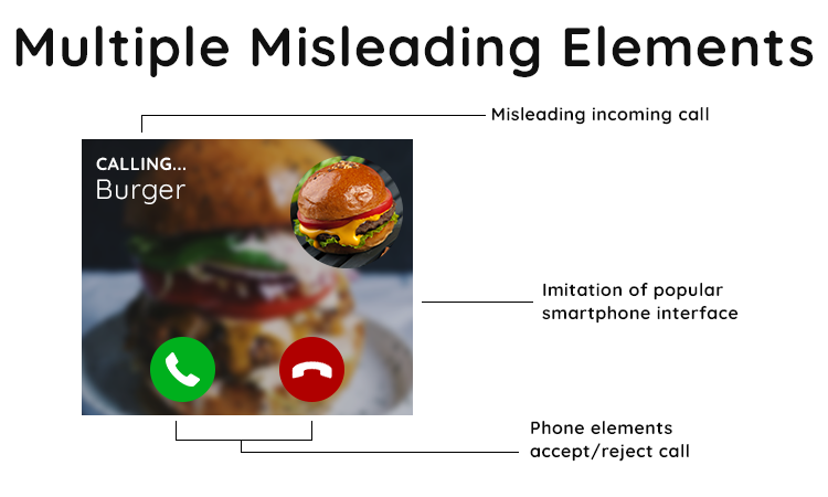
In this case, the banner features a fake incoming call, imitates a smartphone interface and features accept/reject call buttons. We would commonly see this type of ad for dating offers where a man or woman is “calling”.
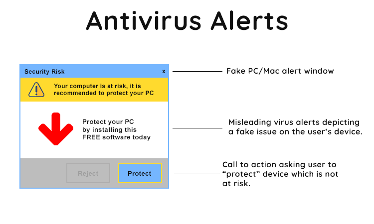
Another style of deceptive advertisement comes with these Antivirus Alerts. The ad resembles a prompt from the user’s operating system misleading them into believing their computer is at “risk” and needs “protection”.
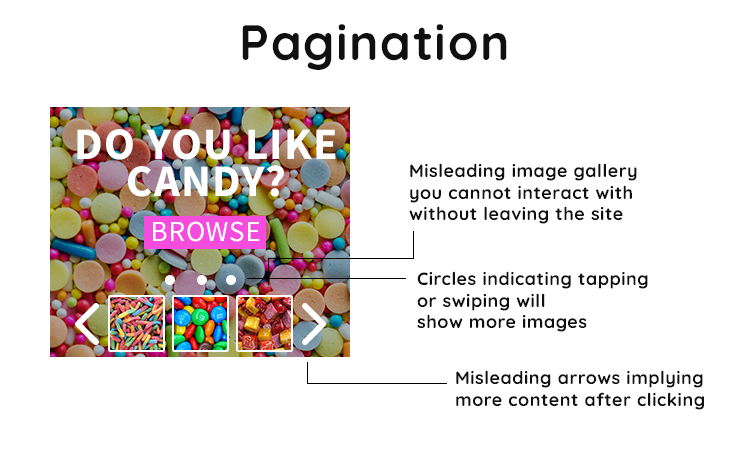
The ad above features three examples of pagination. The three circles, misleading the user into tapping, swiping or clicking will show more images.
Below it, the image gallery and the left/right arrows which you cannot interact with without leaving the page you’re on.
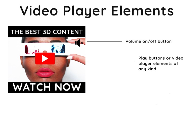
You’re probably familiar with this if you’ve advertised on the TrafficJunky network before. We don’t allow video player elements of any kind.
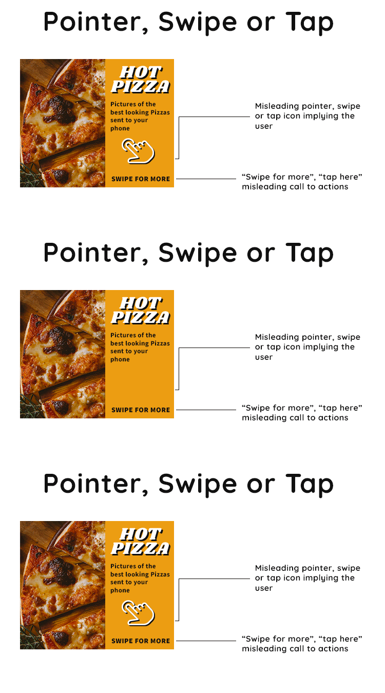
Lastly, animated mouse pointers or finger icons, which insinuate you should swipe, tap or click on an ad in question. Couple that with the “swipe for more” or “tap here” call to action.
Still not sure?
Are you currently using these types of banners on other networks?
We strongly urge you to make the necessary changes to your creatives as per the above guidelines before creating a new TrafficJunky campaign. Your ads might be rejected upon review if you use any of the above-mentioned examples, and this will cause additional delays.
Questions, comments, or concerns? Reach out to support@trafficjunky.com, our team will be happy to assist you.
